
Steve Lacy
Vinyl Jacket Design - Entertainment Design

Overview
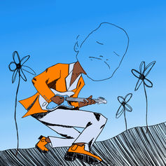
Steve Lacy is a contemporary R&B and Soul artist based out of Compton. He has a fresh take on the genre and is a talented musician and producer, using only his phone to record and make beats for his first releases. This album, "The Lo-fis", includes throw away songs he made in high school that never got released. I've been a huge fan of him since he started releasing music and was excited to make something that would be unique to him as an artist. I wanted to create a surreal scene that complimented his sound.
Category
Entertainment Design, Packaging Design, Illustration, Identity Branding, Student Work
Deliverables
Jacket, Sleeves, Promotional Poster, Vinyls

Initial Sketches

Type Studies

Portrait Paint

Color Studies


For the vinyls I immediately knew that I wanted to use the flower motif I created on clear records. I really wanted to take advantage of the use of the spinning motion so I drew tons of flowers and tested them using After Effects.
Vinyl Studies
Jacket Front & Back


For the jacket I wanted to create an ethereal environment that spanned both the front and back. I was inspired by these particularly deep purple sunsets I would experience while working at my first job. It felt like everything the light touched turned purple.
On the front I drew exaggerated illustration of Steve Lacy playing a guitar to play with perspective and texture. I had the landscape diminish on the back to leave appropriate room for a title and track list.
Gatefold
I wanted to continue the theme of spanning both sides for the gatefold. I thought it would be interesting to draw from the perspective of Steve's guitar. I then took song lyrics and wrapped them around the illustration as a fun opportunity to use type.

Sleeves/Inserts

For the inserts I thought it would be a good opportunity to reference some of his old album art by including photo collage. I thought this was a nice way to break up all of the hand drawn illustration.
For the back of the inserts I wanted to leave a lot of negative space to give some visual rest. I also thought this would make a nice opportunity to work with type so I used song lyrics to create the shape of a vinyl label.
Promotional Poster
For the promotional poster we were challenged to repurpose old assets. I thought it would be smart to reuse the light and shadow layers I created for my illustrations, and layer that with a flower pattern to create a composition that complimented the rest of the set.


Final Mockup


